How To Create Chart On Google Sheets
To make charts in Google Sheets, no matter which chart you are going to make, you should know how to format data. At least for some of the charts, data formatting is an art.
I fear, there is not sufficient documentation available on how to make charts in Google Sheets or format data for the charts.
Everybody knows making the required chart is a few clicks away with well-formatted data.
Without having any proper knowledge of data formatting, you may not achieve your goal of making beautiful and visually rich charts in Google Sheets.
In this tutorial, learn how to make charts in Google Sheets and also how to format data for charts.
I am giving special attention to how to format data for charts because in Excel and Google Sheets there are differences in data formatting in some of the charts. I am sure some of you are familiar with Excel charting.
The best example of the difference in formatting is the Candlestick Chart.
With the help of this tutorial, you can learn how to make all the popular charts in Google Sheets. There are 17 charts included.
What more! You can get my Google Sheets Chart Template with all the charts featured on this tutorial. Here we go!
How to Format Data to Make Charts In Google Sheets
Before going to make charts in Google Sheets, first, you should ask one question yourself. What is that question?
What Would You Like to Show?
To make a good chart in Google Sheets or any other application you should know thoroughly about your data I mean whether it's comparison, distribution, or relationship.
If you can't conclude, follow this tutorial – Choose Suitable Chart for Your Spreadsheet Data – How To.
Once you have that idea look at the charts below and the formatting section under each chart.
Line Chart
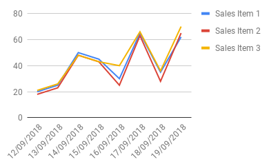
Make the Line chart when you want to visualize a trend in data over intervals of time.
 How to Format Data for Line Chart in Google Sheets
You can format your data for the Line Graph in Google Sheets as below.

The X-axis is the category axis in the Line chart (Column A). It can be time intervals like dates, or time labels.
How to Make a Line Chart in Google Sheets
Select the entire data (here A1: D9)
Insert Line chart from the menu Insert > Chart > Line chart.
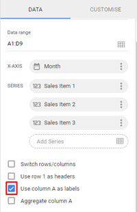
Select "Use column A as labels".
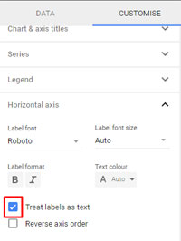
Also, select "Treat labels as text". It's not required if column A already contains text labels, not date or time.
Line Chart – Detailed Tutorial
Area Chart
The Area chart is almost similar to the Line chart. The only difference is in the Area chart is the area between the axis and line are highlighted with colors.
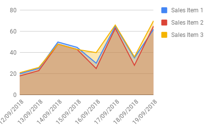
What is the advantage of the Area chart over the Line chart then?
Use the Area chart for comparing two or more quantities.
Formatting Data for Area Chart in Google Sheets
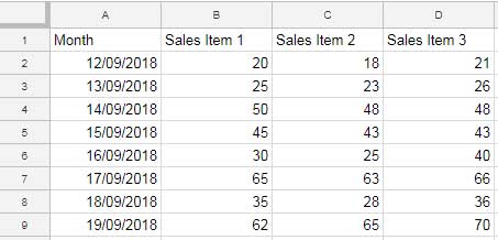
The data formatting in Area chart has no difference from the formatting of data from the Line chart.
How to Make Area Chart in Google Sheets
Select the entire data range.
Insert Area chart from the menu Insert > Chart > Area chart.
Then just follow the procedure listed under the Line chart above.
Area Chart – Detailed Tutorial
Bar Chart
The Bar chart presents categorical data with horizontal rectangular bars. The lengths of the bars would be proportional to the values they represent.
You can use a Bar chart to compare data among multiple categories.
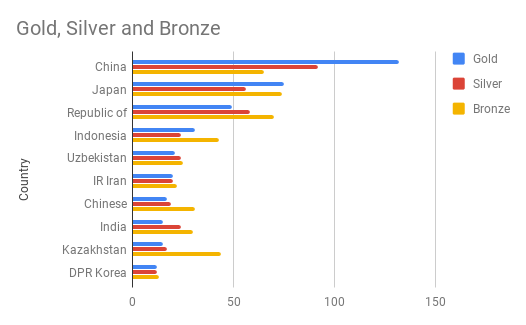
How to Format Data for Bart Chart in Google Sheets
See this image.
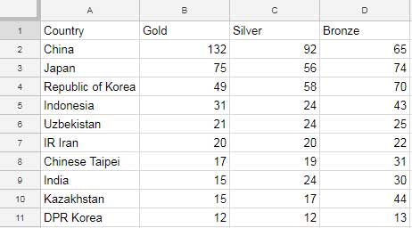
The X-axis is the category axis in the Bar chart (Column A). Enter text as labels in Column A.
How to Make Bar Chart in Google Sheets
Select the entire data.
Click on the Insert menu > Chart > Bar Chart.
Bar Chart – Detailed Tutorial
Column Chart
The Column chart is the same as the Bar chart. The only difference is the orientation of the Bars.
The Column chart presents categorical data with vertical rectangular bars. Here also the lengths of the vertical bars (you can say columns) would be proportional to the values they represent.
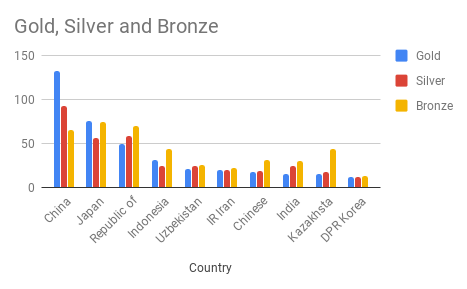
Format Data for Google Sheets Column Chart
Format the data same as the Bar chart above.
How to Create a Column Chart in Google Sheets
Select the entire data by highlighting the range A1: D11.
Click on the Insert menu > Chart > Colum Chart.
Column Chart – Detailed Tutorial
Pie Chart
You are learning how to format data to make Charts in Google Sheets.
Regarding Pie charts, it is being used to visualize numerical proportion in slices of a circle. It's one of the easiest charts to draw.
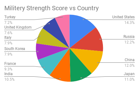
Formatting Data for Pie Chart in Google Sheets
Format the data as below in two columns.
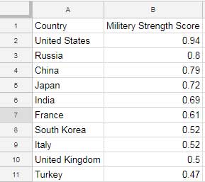
Example on How to Create Pie Chart in Google Doc Sheets
Select the entire data by highlighting the range A1: B11.
Click on the Insert menu > Chart > Pie.
Pie Chart – Detailed Tutorial
Scatter Chart
A Scatter chart is useful to identify the type of relationship between two quantitative variables.
The Scatter chart has similarities with the Line chart especially when the connecting lines are drawn.
Normally in the Scatter chart, the data are displayed as a collection of points and both the axis have numerical values.
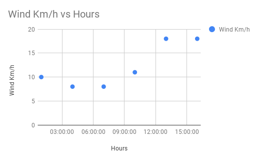
The Formatting of Data in Scatter Chart in Google Sheets
(without data point labels)
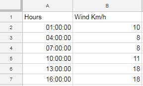
If you want labels in data points, refer to this guide – Google Sheets – Add Labels to Data Points in Scatter Chart.
Plot Scatter Chart in Google Sheets
Just select the data range and from the Insert menu, select the chart Scatter. There are lots of customizations available under the customize tab in the Chart editor.
The notable ones are Trendline and Error bars under "Series".
Scatter Chart – Detailed Tutorial
Bubble Chart
Before going to explain how to create the Bubble Chart, let me share with you what is the Bubble chart is about and its resemblance with Scatter.
Use the Bubble chart to show the relationship between variables. The resemblance of the Bubble Chart with the Scatter Chart is as follows.
1. In the Bubble chart the data points are Bubbles.
2. Just like most of the popular charts, the Scatter chart is also two-dimensional. But the Bubble chart is three-dimensional.
Other than the 'x,' and 'y,' the third dimension is 'z,' which means the size of bubbles.
3. Additionally, with the fourth set of data, you can change the color of Bubbles.
This makes data formatting critical in Bubble charts. Here the title of this tutorial, i.e. How to Format Data to Make Charts in Google Sheets, comes relevant.
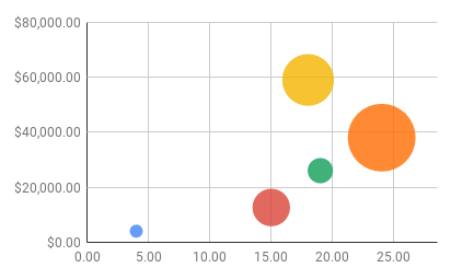
See the data formatting for the Bubble chart that answers your following questions too.
1. How to Control Bubble Sizes in Bubble Chart.
2. How to Change the Bubble Color in Bubble Chart.
How to Format Data for Bubble Chart in Google Doc Sheets
Go through this carefully.

In this, column C controls the color, and column D controls the size of Bubbles.
How to Make Bubble Chart in Google Doc Sheets
Once you have formatted your data, it's simple to make the Bubble chart. Just select the data and insert the Bubble chart from the Insert menu.
Bubble Chart – Detailed Tutorial
Geo Chart
Use a Geo chart to show a map of the world or a continent in which the values for each location will be shown with colors.
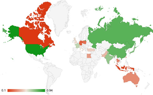
How to Format Data to Make Charts Geo or Geo with Markers
Data for Geo Chart:
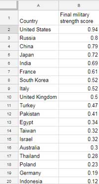
You can use this format for the Geo chart (the one shown above) and the Geo chart with markers.
In Geo chart with markers, you can control the bubble/marker size. If so add one more column (Column C) and enter the size like in the bubble chart.
That means the first column should contain the country, region, or continent names, the second column the value to control the color and the third column controls the bubble size.
How to Plot Geo Chart in Google Sheets
Nothing concrete here. Just select the range A1: B and insert the Geo chart from the chart menu.
Geo Chart – Detailed Tutorial
Waterfall Chart
The Waterfall Chart is also known as Cascade or Bridge chart. So this section is the answers to your below questions too.
1. How to create a Bridge chart in Google Sheets.
2. How to create a Cascade chart in Google Sheets.
Use a Waterfall/Cascade chart to visualize;
How an initial value is affected by a series of intermediate +ve or -ve values.
Features of Waterfall Chart:
1. The initial value is represented by a whole vertical bar (column.) The same is the case with the final value.
2. The intermediate +ve, as well as -ve values, are represented by floating vertical bars (columns).
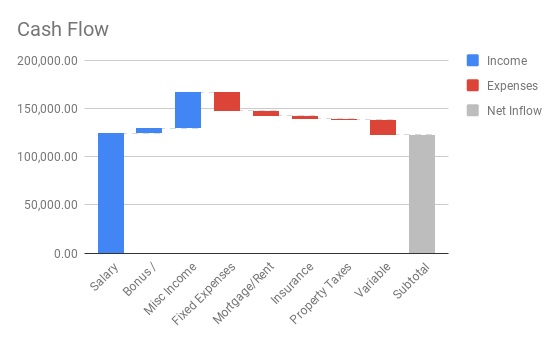
How to Format Data to Make Waterfall Chart
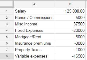
It's two-column simple formatting.
How to Make Waterfall Chart in Google Sheets
Select the data A1: B8 and then insert the chart from Insert > Chart > Waterfall. But here you must customize the series names.
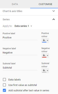
By default, the series name of the Cascade chart in Google Sheets will be positive, negative, and subtotal.
I have modified it to income, expenses, and net inflow in my chart above. Name your chart series as per the nature of your data.
Waterfall Chart – Detailed Tutorial
Histogram
Many spreadsheet users confuse Histogram charts with Column Charts. Both are entirely different. The only resemblance is the vertical bars.
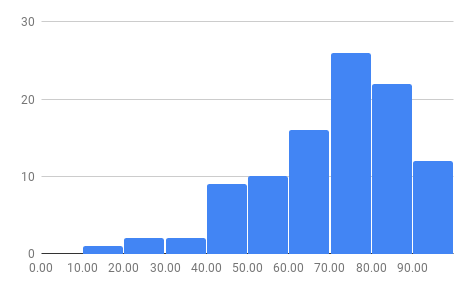
Use a Histogram chart when you want to visualize the distribution of numerical data in a given range of values called buckets/bins.
The frequency of the values in each bin determines the height of the columns.
Always the best example of a Histogram chart is the marks of students in an exam.
For example;
There are 50 students in a class. I have their marks (out of 100) entered into a column in Google Sheets.
With Histogram, I can easily visualize how many students scored less than 30, scored in the range 30 to 40, 40 to 50, and so on. These ranges are called Bins.
How to Format Data to Make Histogram Chart
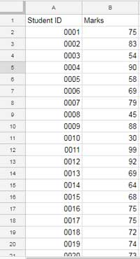
Actually, as per the example above, we only want the marks of students to plot the Histogram. But format the data as below.
How to Make Histogram Chart in Google Sheets
Here only select column B. Column A is not required in the Histogram chart. Then insert a chart like Insert > Chart > Histogram.
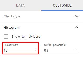
Change the Bin/Bucket size as required.
Histogram – Detailed Tutorial
Radar Chart
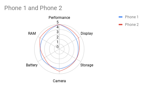
The Radar chart looks like a spider web so it's also called a Spider chart.
The Radar chart shows one or more variables in a two-dimensional graph, with one Spoke for each variable. Useful in business performance and quality analysis.
I find the Radar chart very effective in visualizing product comparison over several criteria.
How to Format Data to Make Radar Chart
The below sample data shows the performance score (out of 5) of (features of) two popular Smartphones (I am not naming it here though)
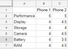
How to Make Radar Chart in Google Sheets
Go to the menu Insert > Chart > Radar chart.
There is one must to do customization under the "Customise" tab, i.e. click on the vertical axis drop-down and set "min" value to 0.
Radar Chart – Detailed Tutorial
Gauge Chart
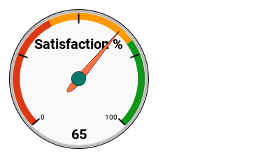
The Gauge chart is a minimal graph that looks like the speedometer of a Car. So it's also known as the Speedometer chart. The dial-in Gauge chart shows information quickly readable.
A speedometer chart is common in many Dashboard reports to show the overall performance, whether it falls in the expected range or not.
How to Format Data to Make Gauge Chart
It's the simplest form of a chart like the Pie.

How to Make Gauge Chart in Google Sheets
The data formatting is simple in the Guage chart. But here chart customization is important. Then only you can visually read the performance score.
As usual select the entire data, here A1: B, and go to the Insert menu and click the chart. There select the Gauge chart.
Here is the essential customization that you should make in the customize tab of the chart editor.
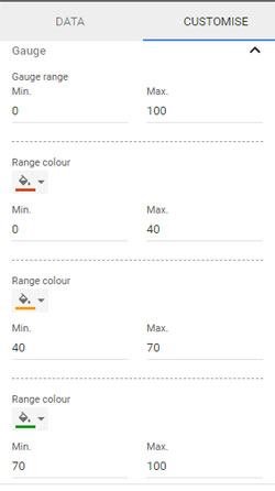
It controls the color on the gauge. Set the min-max values as you want.
Gauge Chart – Detailed Tutorial
Candlestick Chart
Google Sheets is the best place to make a Candlestick chart. You know why?
A Candlestick chart is a financial chart that is primarily used to plot the price movements of a stock or currency.
In that aspect, Google Sheets is the best as it has the function to import historical stock as well as currency rates.
Regarding historical stock price, I have my custom GoogleFinace formula for you.
Just enter the below formula in Cell A1 in a blank sheet and then change the stock ticker symbol which twice appears in the formula. Also, don't forget to change the start and end date.
Here in this formula, the start date is 01/08/2018 and the end date is 31/08/2018 (The full month of August in 2018)
={ArrayFormula(text({"Date";int(query(query(googlefinance( "NSE:HINDALCO" , "all" , "01/08/2018" , "31/08/2018" ) ,"Select Col1",1),"offset 1",0))},"DD-MM-YY")),query(googlefinance( "NSE:HINDALCO" , "all" , "01/08/2018" , "31/08/2018" ) ,"Select Col4,Col2,Col5,Col3",1)}
If you can't make it straight, don't worry, you can get my Sheet with all the charts in this tutorial plus the formula above.
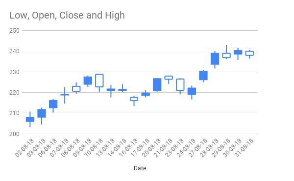
How to Format Data to Make Candlestick Chart
Just use my above formula in Cell A1 in a blank worksheet. It will take care of the formatting of data for the Candlestick. Here is the format.
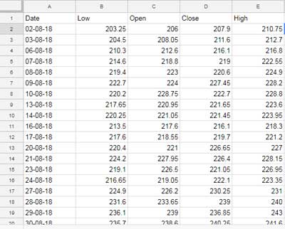
How to Make Candlestick Chart in Google Sheets
Nothing important here. If you have your data well-formatted as above, just insert this chart from the Insert menu > Chart > Candlestick.
Candlestick Chart – More Info.
Organizational Chart
The Organizational chart displays the hierarchy of employees. It helps an onlooker to easily find the concerned person in the office and to reach out.
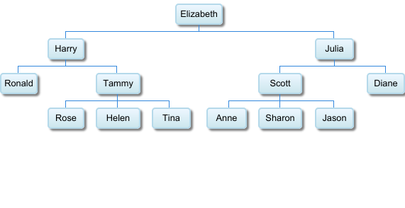 How to Format Data to Make Organizational Chart
Enter the name of employees in column A and their reporting officers' names (immediate boss) in column B.
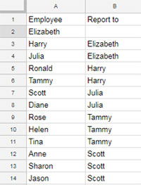
How to Make Organizational Chart in Google Spreadsheets
Go to the menu Insert and select Chart, Organizational chart.
Organizational Chart – More Info.
Treemap Chart
Use the Treemap chart to display hierarchical data in nested rectangles (tree-structured).
Treemapping is popular in comparing proportions within the hierarchy. The best example is the display of patient wait time in each department in a clinic.
Each category in treemap has different colors. This shows the approximate waiting time in each department. Larger the rectangle, the longer the wait time.
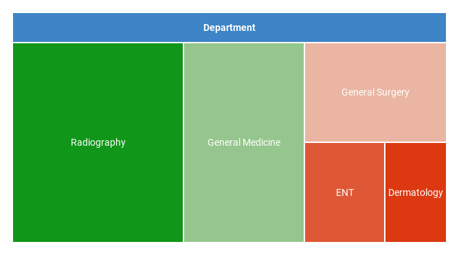
How to Format Data to Make Treemap Chart
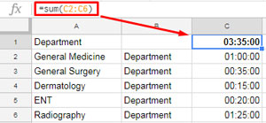
This follows the same Organization chart data format. But here there is a third column contain numerical values that determine the size and color of the rectangle in the treemapping.
In the first row in C1, see the formula to calculate the total of column C.
How to Make Treemap Chart in Google Spreadsheets
Just select the data here in the range A1:C and insert the Treemap chart as usual from the Insert menu Chart. The data should be well formatted as above.
Treemapping – More Info.
Annotated Timeline Chart
Annotated Timeline chart is an interactive time series line chart.
Google Sheets says there is an option to add notes (annotation) but at the time of writing this post, I fear that is not functioning.
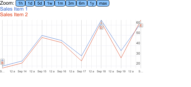
Note: The original Annotated Timeline chart looks different in Google Sheets. When I save the graph it changes as above.
How to Format Data to Make Annotated Timeline Chart
Here I am using the same data used for the Line chart above. But adding two additional columns for annotation.
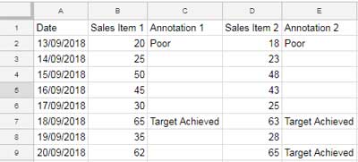
How to Make Annotated Timeline Chart in Google Sheets
The data is ready with you. Now you only want to select it and click the menu Insert and select the Chart > Timeline.
Annotated Timeline Chart – More Info.
If you are looking for a professional Timeline (Gantt) chart, here is my tutorial. It uses the popular Wrike project management tool which is free to try.
Must-Try: Create a Gantt Chart Using Wrike Online Project Management Software.
Table Chart
Table-Chart is useful for creating beautiful Dashboards in Google Sheets. You can transform your long list of data into a paged chart which is interactive.
This chart allows you to sort your data within the chart and also offers pagewise navigation. So within limited space, you can include your long list of data.
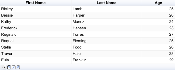
Just click on the header to sort the relevant columns. The page navigation is placed at the bottom.
How to Format Data to Make Table Chart
Nothing concrete here to mention. Just use your existing table. The above chart itself shows the data formatting.
How to Make Table Chart in Google Doc Sheets
Select your table and click Table Chart from the Insert menu, Chart.
Table-Chart – More Info.
Can you provide me your sheet that contains the above charts and formatting?
Why not? Here it's.
Download Google Sheets Charts Template (All Popular Charts)
I have included an index page in that sheet for easy navigation.
Additional Reading: Create a Gantt Chart Using Sparkline in Google Sheets.
How To Create Chart On Google Sheets
Source: https://infoinspired.com/google-docs/spreadsheet/make-charts-in-google-sheets/
Posted by: youngallind.blogspot.com

0 Response to "How To Create Chart On Google Sheets"
Post a Comment